Then, you will see the data in 2 parts. Let's go over them.
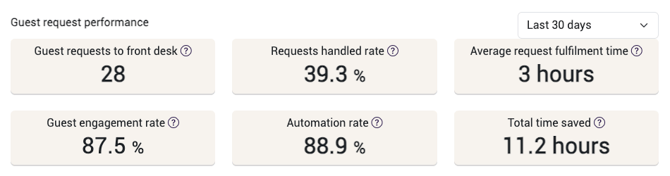
On top you will see 6 numbers.
- Guest requests to front desk
This shows the number of requests received by the front desk during the selected timeframe. - Requests handled rate
This is the ratio of how many of the requests showed in 1 have been picked up and answered. - Average request fulfilment time
This is calculated by taking the time the front desk took to answer the requests in 2 divided by the number of requests in 2. - Guest engagement rate
Here we divide the number of guests that interacted with an initiated message by all guests that received an initiated message. We exclude guests that opt out from communication with the word "silence". - Automation rate
This is the percentage of the messages received that have been answered by AI. - Total time saved
We calculate this by using 3 minutes per answered question and 10 minutes for every completed online checkin.
In the lower part you'll see the following graphs or tables:
The first one is the Guest Request Topics. Here you can switch between a list view or a pie chart. It shows which topics are most talked about by your guests.

The second one is the ROI calculation per guest request. Here you can also switch between a list view or a pie chart. It takes the requests sent to front desk and calculates based on the ROI settings.

Next up, we have the Messages per channel.
Here you can see the number of sent messages per channel for the chose timeframe, outside of the Guest Journey Builder messages.
Then we see Events. This shows these 4 data points.
- Online Checkin messages sent
This shows the number of online check-in messages that were automatically sent to guests - Integrated online-checkins completed
This shows the amount of online check-ins that were completed through the Runnr.ai online check-in page. - Doors opened
This is the number of times guests used digital keys to open doors. - Invoices sent
This is the number of invoices that were automatically sent to guests.
Below the Events, you can see the line chart for Satisfaction.This shows the percentage of users that clicked "Pleasant" on the question whether they had a good stay, in Green. In Purple you will see the benchmark satisfaction score for the Country that the accomoddation is located in.

Below the satisfaction chart you can see a Data export menu. This will give you the option to make an export of message counts for a specific timeframe. In this export you can see the following data:
Reservation ID, Check-in Date, Check-out Date, Risk of Bad Review (0-1), Messages Received from User (Total), Messages Sent to User (Total), Messages Received from User (WhatsApp), Messages Sent to User (WhatsApp), Messages Received from User (Booking.com), Messages Sent to User (Booking.com), Messages Received from User (SMS), Messages Sent to User (SMS), Messages Received from User (Airbnb), Messages Sent to User (Airbnb), ROI Total Upsell, ROI Q&A Cost Reduction, ROI Restaurant Reservation, ROI Spa, ROI Celebration, ROI Bike Rental, ROI Contact the Frontdesk, ROI Late Checkout, ROI Breakfast, ROI Room Upgrade, ROI Early Checkin and ROI Book Parking.
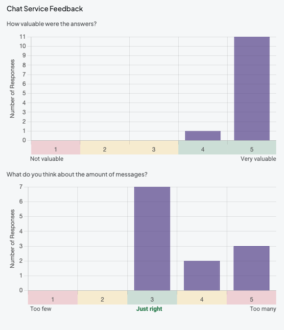
And finally you can see the Chat Service Feedback. This is the feedback on the use of Runnr.ai, which we sometimes ask to guests, including the 10 most recent written comments.
Now you know all about the analytics you can find within Runnr.ai!